BPO Services is a contact centre with more than ten years behind it: outbound and inbound calls, telemarketing, customer surveys, web chat and email support, in five languages. They sell to other businesses, so the website has to do what their operators do on the phone, explain quickly, sound credible and turn interest into a conversation.
A site that sells a service you cannot see
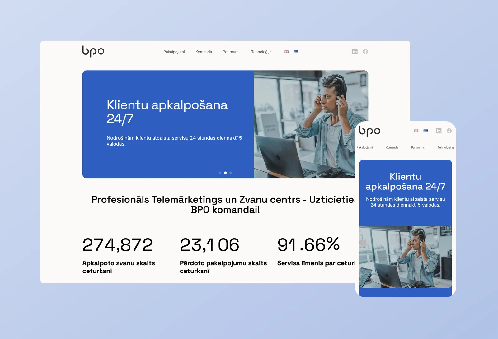
A call centre has no product to photograph. We built a custom WordPress theme around the things a buyer actually weighs up: the service itself, the proof and the people. Every service has its own page with a short lead, the benefits and a contact form at the end. The homepage opens with the last quarter’s results: calls handled, sales made and service level, then the reasons to choose them, a testimonial from a client, and the logos of companies that already trust them.
Pages are assembled from flexible blocks in ACF, so the team adds a new service or rearranges a page without touching code. The site runs in Latvian, English and Estonian.
A services hub that keeps itself up to date
With close to twenty services in three groups, a mega menu alone was not enough. We added a services hub in Latvian and English that reads the menu itself, so it shows the same groups in the same order and follows along whenever the team edits the menu. A new service appears on the hub the moment it is published, with no second place to update.
Kept in shape year after year
The work did not stop at launch. We added a blog that the client’s own team now publishes to, built new service pages from their copy, and updated the company’s address and contacts across all three languages when they relocated.
We also worked through a technical SEO audit: a single H1 on every one of the 68 pages, alt text on every image, service graphics converted to lighter WebP, English and Estonian pages cleared of leftover Latvian labels, and every contact button pointing where it should.