Choosing a good color scheme for your website may be a terrifying thing, particularly if you don’t feel comfortable about your ability to coordinate colors or you don’t feel like a professional designer.
How to choose good website color schemes is usually most popular question when we build websites to our clients.
- What color to use for your logo or headline?
- Do you know how to select colors which combine well?
- What section of your website is color you can use?
It can be a difficult game to pick and match colors.
The result could look harmonious, or straight out of a horror movie.
Your website can look uninspiring and forgettable if choose wrong colors. When you use your website too much colors, you risk making it look tacky.
Besides not knowing how to choose the right template design, learning how to use color when designing your website is one of the biggest challenges that any DIY website owner can face. It is especially valid if you don’t have the perfect color and design aptitude.
If you draw a blank on what and how to use color in the appropriate way on your website, this post can help.
You will simplify color usage once you know the right steps to take.
So we’ve put together this guide to show you, step by step, how to:
- Select the dominant color that fits your website and brand.
- To build the dream color scheme, combine complementary colors.
- Choose a color on the backdrop that will work for you.
- Using color at the right places on your website-like a pro.
How color can improve your website and brand identity
What is the first thing that pops into your mind when I ask you to think about Coca-Cola?
Okay… an ice cold bottle of Coca-Cola might be one of them.

Without seeing the color red, it is very hard to think of Coca-Cola. The color red is just as much a part of Coca-Cola as its iconic drink.
Did you knew that Coca-Cola ‘s decision to use red as its logo color wasn’t accidental?
The color red has two main purposes:
1. The red fire color helps Coca-Cola to stand out in store shelves from its competitors; and
2. Every color has various emotions and feelings attached to it. It causes emotional reactions, such as anticipation, boldness, affection and passion, when people see the color red. Precisely these are the emotions Coca-Cola wants you to associate with its drink.
You ‘re doing so much more than just making it look good when you choose the right color for your website — you ‘re building a memorable brand.
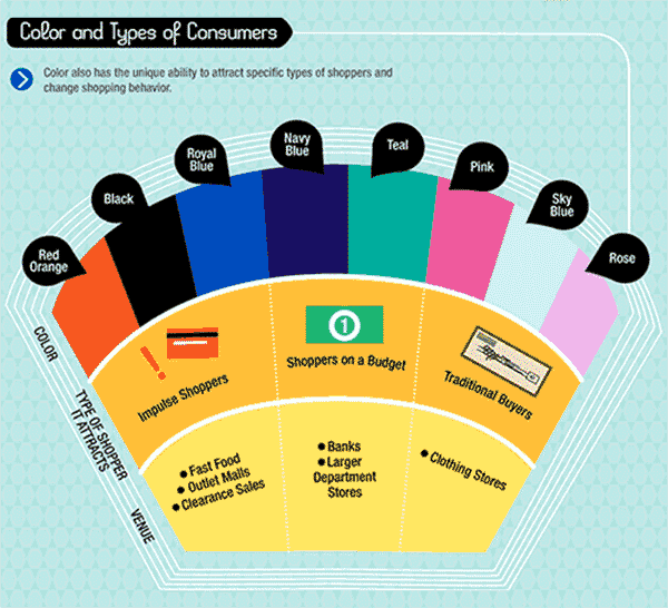
85% of shoppers place color as a primary reason for why they buy a particular product.
Source: Kissmetrics
By now, you should be thinking “Wow, color is like magic! Why aren’t more people ‘profiting’ from it? Okay, because most people have no idea how.
And in the next part, we’ll show you three simple steps you can take to start using color on your website to your advantage.
3 Steps to use color on your website – the best way to do so
There are 3 main colors you need to consider when you are designing your website:
- Choosing a dominant color to color the brand
- Select 1 to 2 accent colors
- Choosing a background color to finish the template

How to pick few colors fast?
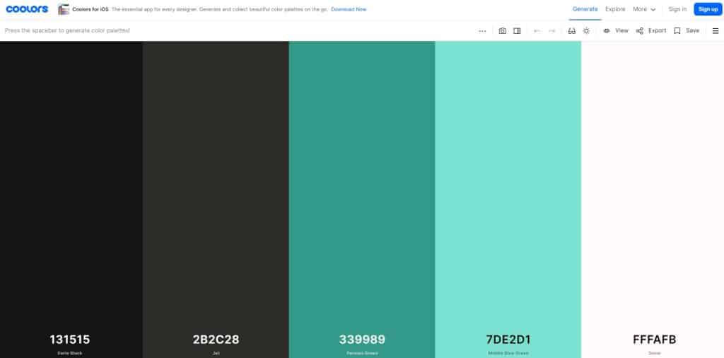
We suggest to use Coolors free tool. With this tool you can quickly find best colors that fit together with your website. If you already know 1 or 2 colors you would like to use, you can choose them for your website, lock them in and with pressing “space” Coolors will give you more ideas. When you have picked your colors, you can send them to your developer.

If you’re still not sure, you can see trending color schemes.
Color plays an important part of the way we view the world. This can also dramatically change how we consider a website to be. Yet color scheme still takes up a backseat when it comes to website design. Six valuable tips for creating a beautiful color scheme on a website:
- Get to know color psychology basics
- Acquaint yourself with color theory
- Think about mixing color combinations
- Keep it simple
- Contrast your colors
- Integrate your branding


