Key takeaways
- Many users who are attempting to narrow down the list may find it easier to do so by using the promoted filters in the product list.
- Still, 60% of websites don’t promote filters.
- Additionally, promoted filters must stay in their “original” positions.
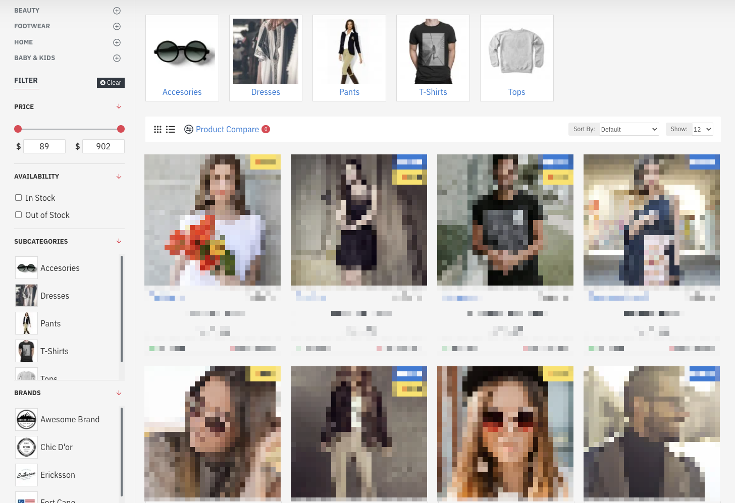
Price, size, and color are frequently the most used filters (for clothing and other visually appealing things). Other filter types, on the other hand, remove a large number of things when applied, leaving only a selected type or style.
For instance, a lot of people will be drawn to specific product colors or styles. The majority of users will notice these filters right away if they are offered both in the standard filtering interface and at the top of the product list. If they choose to apply one, the list will soon become much more customized to their preferences.
However, according to our e-commerce UX research, 60% of websites do not advertise filters in the product list.
In this post, we’ll go over the results of our study, the fundamental UX opportunity of highlighting significant filters, and one implementation issue to be mindful of.
Opportunity for UX: Promoted Filters Can Significantly Accelerate Product Search
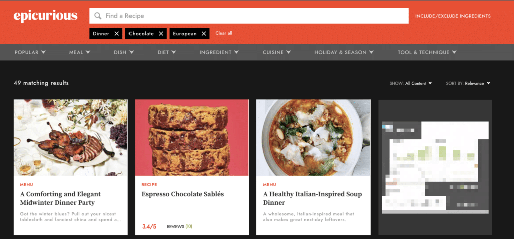
Important filters may be missed for a variety of reasons if they are only visible in the filtering interface, whether it be the separate filtering interface on mobile devices or a sidebar on desktop computers.
Specifically, it is possible that they become “lost” between various filter types and values, and consumers fail to recognize their significance.
Additionally, depending on the product type, lists of available filters and options can get rather lengthy. While offering a large number of filters is beneficial, end customers may find it to be quickly overwhelming.
Furthermore, users unfamiliar with a given topic might not recognize the key features of a product and would not be able to distinguish them in the standard filter interface.
Not every customer purchasing a new laptop, for instance, is aware that the “Chromebook” is a technological advancement to take into account. Therefore, key filters should be promoted so that they are more highly visible than other filters in order to gently urge users toward those that are thought to be more valuable than others. If you have the capabilities you can incorporate dynamics filters based on the category the customer has entered.
What occurs if the optimization of your product filters is subpar? Some customers will quit your store if they are unable to find items that satisfy their wants. In the end, this will hurt your revenue and lower your conversion rate.
Unfortunately, not many e-commerce sites make good use of product filters. As to the findings of the Baymard Institute’s research, a mere 16% of prominent e-commerce websites offer a satisfactory filtering experience. 20% of those websites lack thematic filters (season, style, etc.) even though they sell products with clear thematic elements, and 42% of those websites lack category-specific filter types for their primary product categories.
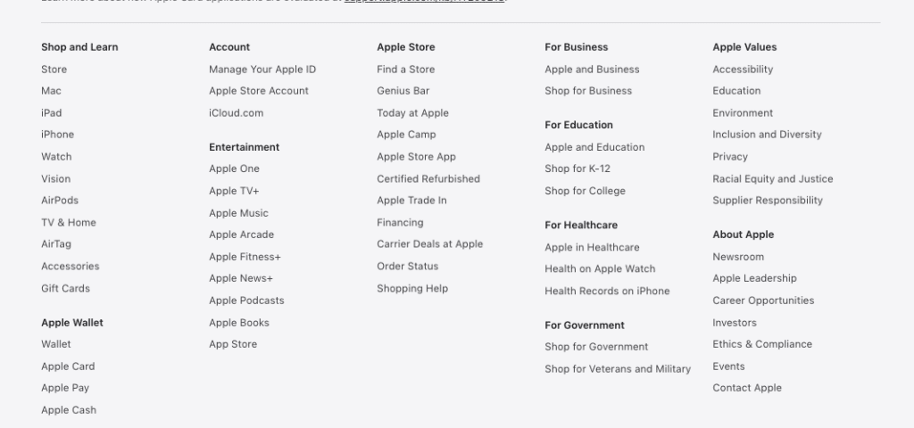
Check out Apple’s website, for example. The filtering at the bottom of the webpage is a little basic and difficult to utilize. Do you think one of the top tech companies in the world fails when it comes to filters?
On mobile devices, promoted filters can be very helpful.
Mobile users can benefit most from promoted filters.
One reason for this is that, in contrast to desktop environments where filters are frequently visible in the left sidebar or in a horizontal filtering bar, mobile devices often hide the majority of their filters until users access the filter interface. As a result, it may not be immediately obvious to users upon landing on a product list how to start narrowing the scope of the list or what filters have already been applied.
For instance, if promoted filters are available for every product and configuration in a mobile product list, users can start filtering the list right away to find products that specifically interest them without even opening the filtering interface.
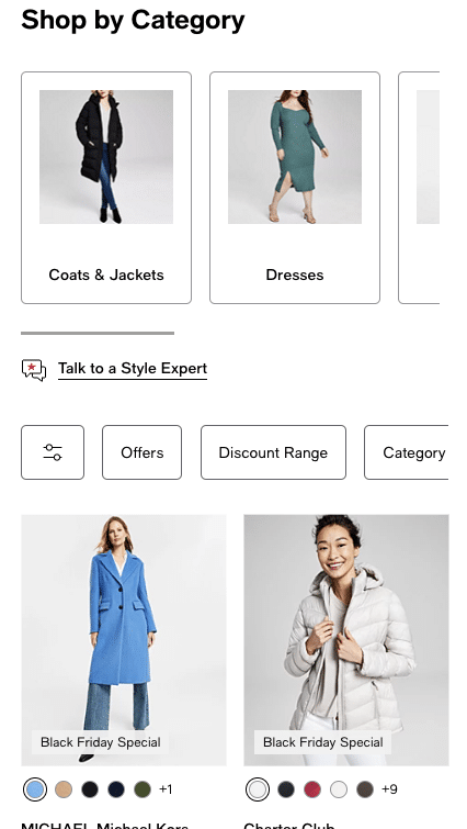
Moreover, customers would have to repeatedly switch between the product list and the filtering interface on mobile devices in order to customize the list according to their preferences because filters are usually located in a different interface.
Appropriate promoted filters could shorten the time and effort required to apply the initial filter, allowing users to begin the process of filtering the list more rapidly.
Furthermore, the limited viewport on mobile devices influences the way promoted filters are presented, as usually only two or three can fit on a single line.
One way to display more than two or three promoted filters on a website is to make them into lists that can be scrolled horizontally, either with scroll indicators or using truncation.
Conclusion:
- Keep your product filters simple;
- Plan before you begin;
- Test as you build;
- Take your customers’ perspectives into consideration when creating your products;
- Employ the terminology that your clients use to explain your offerings;
- Provide the product details;
- For busier categories, search for higher-level groups of qualities;
- Make the filters on the page stand out from the others;
- Different filter setups are needed for different products;
- Provide an illustration of the active product filters;
- Have your audience test the location of the filter;
- Don’t overwhelm the user;
- Think about utilizing separate filters for desktop and mobile;
- Optimize for both practicality and filter speed;
- Employ promoted filters to make it easier for customers to access well-liked subcategories;
- Use filters to outperform your rivals;
- On websites of all sizes, apply product filters unless you have a really small product base;
- Disable filter settings that yield no results;
- Permit users to apply several of the same kind of filter values;
- Display the applied filters both in their original context and as a summary;
- Prevent scrolling while using the product filters;
- Sort filters by significance rather than alphabetically;
We Can Assist You with the Best Filtering UX Practices
Do you presently use any or all of the tactics on our list?
Don’t worry if you still have a ways to go—you’re among excellent company. As we previously stated, only a few of the brands offer a robust product filtering interface. And there’s always space for improvement, even if you already provide high-quality filters.
But keep in mind that you’re not just enhancing these filters for their own sake. By implementing each of these upgrades, you’re removing obstacles and easing the purchasing process for your customers.
In summary, the more you strive to incorporate these methods, the more likely it is that you’ll not only break into the percentage that does the job correctly, but also give your visitors an amazing experience and, most importantly, increase conversions.
Which filtering techniques will you implement on your e-commerce website first? Not sure how to get started? We understand that it is inconvenient to invest in traffic at the expense of stagnant revenue. Here at Green Wire Media, we assist online companies just like yours in eliminating every obstacle to conversion. Our team will examine your website, identify the reasons behind its failure to convert, and provide solutions. Get in touch with us and receive a free audit.

